Graphic Works | Miscellaneous
This page contains miscellaneous graphic experiments done as a student of Communication Design at ISDI | Parsons
These outline my journey of looking for new graphic styles outside conventional visual trends. All of these works center around simple ideas I was interested in at the time, expressed visually. These range from my own experiences as a Tamilian in India, to tributes to movies, to visual expressions of concepts I read about in books and media.


The ‘Annan’ series references graphic posters that adorn the urban walls of my hometown, Chennai - the capital of Tamil Nadu. Such posters are usually political propaganda and are expressed in loud, fluorescent color schemes. Using the motifs of the Tamil typeface ‘Baloo Thambi’, I expressed an idea against authoritative totalitarianism. The key text reads “Periyya Annan unnai paarthu-kondirkuraar” when translated reads “Big Brother is watching You” and posters are rendered in the 3 popular colorways used commonly.


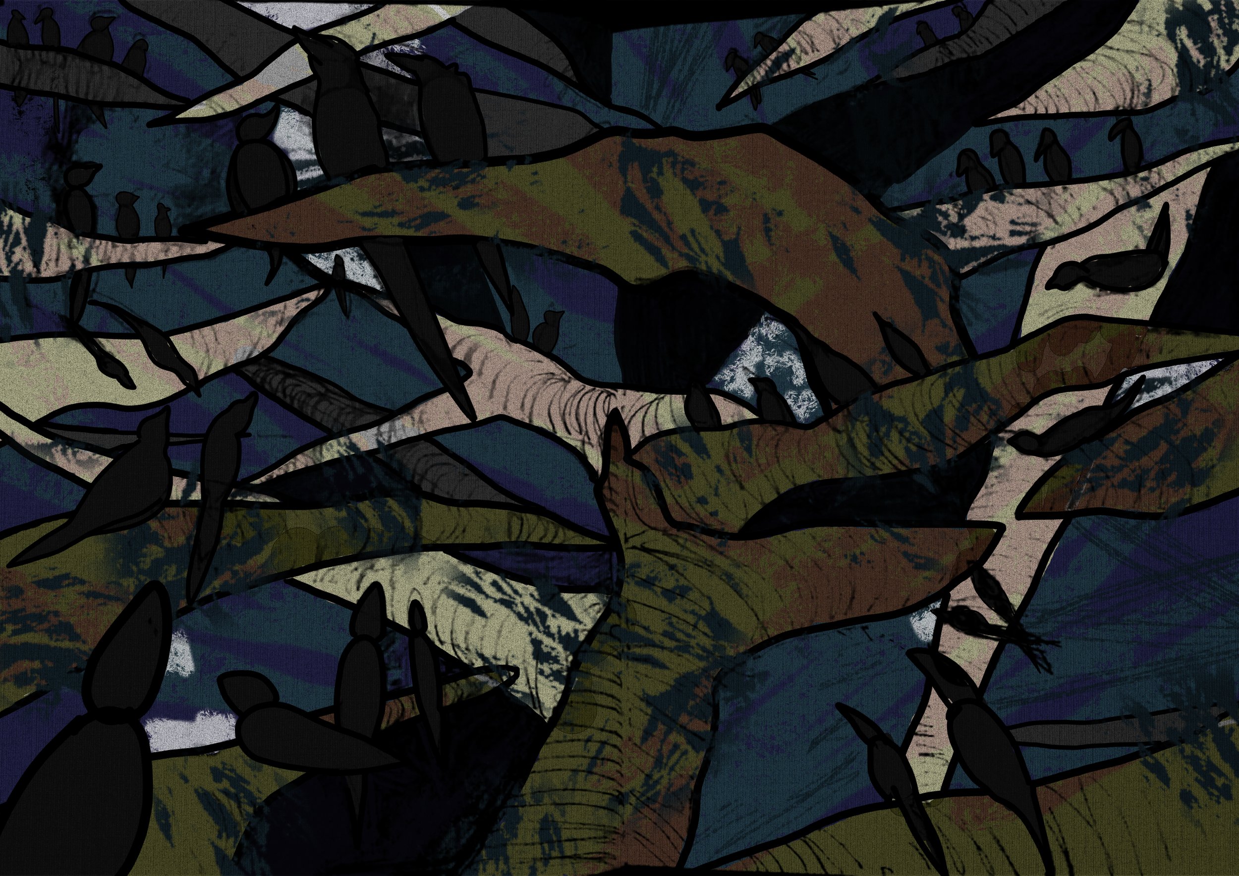
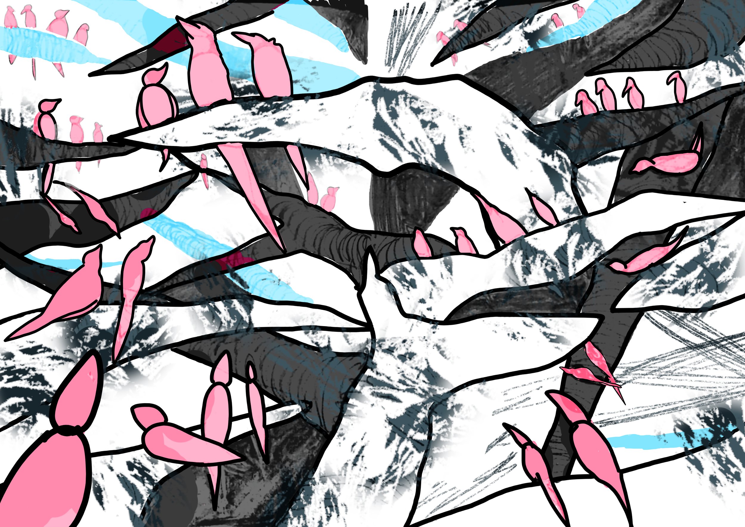
‘Kaakai Samaachaaram’ or ‘Crow Affairs’ is a piece that expresses a common nightly phenomenon in Chennai. Large crow populations begin to loudly caw after 3:30AM in the morning. I could only imagine they had important affairs to discuss, at the expense of my sleep. I wanted to express the endless meeting halls of the crows through layers of tree branches extending into space, each branch occupied by a crow senator.
The original eastern Dragon, much like chimeras and manticores, is a mythical figure imagined as an amalgam of animals. In ancient times, artists would make representations based off hearsay and eyewitness accounts, and these images would evolve into legends alongside culture. If the Dragon were spotted today, it would be treated as an urban legend or a conspiracy theory, with grainy blurry images making the rounds on the internet, as people heatedly debate it's existence.
These images combine the body parts of the various animals, and are ‘photorealistic’ reconstructions of an eastern Dragon.
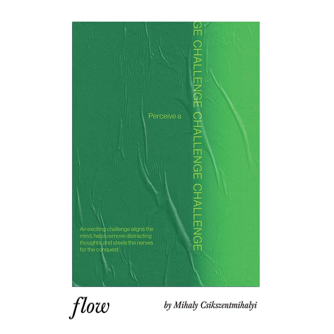
The ‘FLOW’ posters are a typographic reaction to the acclaimed book by Mihaly Csikszentmihalyi. Wanting to integrate the lessons of the book into my life, I designed these posters specifically to print and put up in my room.
Ideas expressed from reading about scapegoats & triangular desire by Rene Girard.
I fashioned a 'calligraphic' nib from an apple stem and made the marks with ink. The asemic writing system makes compact word-blocks with symmetrical curls on both ends. Consonants are rotated on their sides, or left as is and extended to swashes, while vowels are nested inside.
‘Mohit’ meaning ‘enchanted’ is a simple poster made in the lo-fi pop graphic style used commonly by magazines and publications in the pre-digital days of post-colonial India
This series contains an original image-making style I experimented with. Repeating elements, color blocking with negative space and intentionally crude line drawings in order to graphically emphasize a single concept.
1 emphasizes visual paradoxes and references Rene Magritte’s famous work and also a common literary paradox where pages left intentionally blank, aren’t actually blank.
2 emphasizes the primal hunger of a hunter-gatherer and their delirious thoughts while in desperate starvation.
3 references a Tamil-Brahmin counting system that is done solely with the hands, to keep track of chanting mantras when they exceed numbers of over a hundred.
“The sky burns from saffron to blood orange.
A nation ensnared in social turmoil rethinks it's norms of reality.
Security of it's own children in the dark, the overton window pans and shifts,
nationalism turns into fascism, radicalism turns into policy while,
The foundations of it's identity are reshaped by a section of it's people, thinking it's theirs completely to own.”
A short passage to protest the NRC and CAA acts passed in November 2020 in India. The Overton Window is a concept in political theory that refers to the gradual normalization of extreme acts through smaller incremental acts in the same vein, that slowly skews the idea what is normally acceptable.
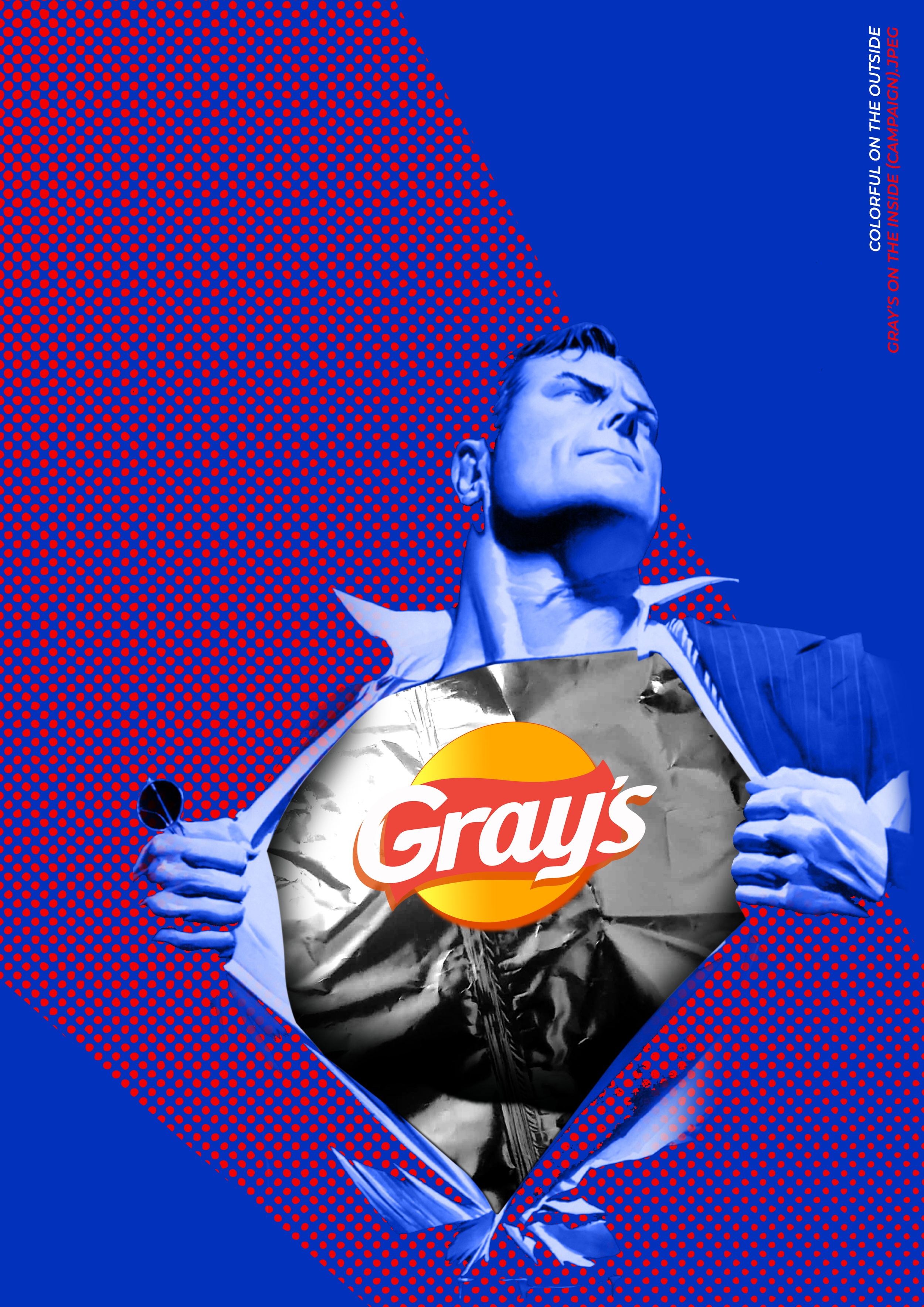
'Gray’s’ references Indian snack packets filled with air to feign more quantity than actually contained within. A Western version uses Superman to convey the concept and an Indian version uses the well-known story of the god Hanuman ripping open his chest to prove his loyalty to his lord.
Quick works exploring tactile and macabre sensations, while straying out of conventional graphic design trends.
A poster tribute to Pierrot Le Fou, by Jean-Luc Godard.
The bright primary colors evoke the juvenile, non-conformist mood of the film while the meandering typography and graphic line work intend to evoke the playful and lighthearted romantic journey of the two rebellious lovers.


